Mostrando postagens com marcador arte. Mostrar todas as postagens

Berlin cancels Iran modern art exhibit after bureaucratic run-ins

An exhibition on art from Iran has been canceled after Iran's President reportedly refused to issue papers for the artworks to be exported to Berlin. The cancelation comes after serious accusations of Holocaust denial.
It was supposed to be a major highlight for the cultural year ahead, and an important signal in improving ties between Iran and the West. But the planned exhibit "The Tehran Collection - Tehran Museum of Contemporary Art in Berlin" has now had to be called off entirely. The president of the Prussian Cultural Heritage Foundation (Stiftung Preussischer Kulturbesitz) Hermann Parzinger announced earlier that the much-anticipated art show would no longer be taking place.
After repeatedly suffering teething problems, the foundation "regrettably had to decide to take this step," Parzinger said, adding that he had no choice but to cancel the intercultural cooperation agreement signed with the Tehran Museum of Contemporary Art (TMoCA) after Iran had failed to produce required export permits for artworks intended to be shown in Berlin.

The Tehran Museum for Contemporary Arts (TMoCA) in recent years has started to show some of the previously banned art treasures from its vaults
The bureaucratic issue as well as other stumbling stones resulted in the art exhibition being delayed once before, with an intended opening date of December 4, 2016, being indefinitely postponed earlier in the year.
"We can't stand for any further delays," he stressed, underlining that his foundation was part of the government-run Berlin State Museums group (Staatliche Museen zu Berlin), which could not afford to have further changes applied to its planning for the year ahead.
Parzinger said that his foundation would remain "in dialogue" with Iran, adding that the Prussian Cultural Heritage Foundation was always keen to nurture culture exchange.
A Holocaust on art
The exhibit was regarded as another key step in the overall notion of rapprochement between Iran and the West. Following the 2015 nuclear deal framework with Iran, of which Germany was also a signatory, the Prussian Cultural Heritage Foundation initiated the exchange, hoping to help open Iran further to the rest of the world by inviting the TMoCA to hold a show at the prestigious Berlin Portrait Gallery (Berliner Gemäldegalerie).
Bundesaußenminister Frank-Walter Steinmeier in Teheran (picture-alliance/dpa/B. von Jutrczenka)
Politicians like German Foreign Minister Frank-Walter Steinmeier were instrumental in facilitating the planned exchange but had to distance themselves later
In addition to highlighting Iranian artists such as Mohsen Vaziri Moghaddam and Faramarz Pilaram, the artworks-on-loan from the TMoCA were supposed to include important pieces of modern art from the West, including masterworks by Claude Monet, Pablo Picasso and Jackson Pollock.
These artworks had reportedly been purchased by Iran's then-reigning Pahlavi dynasty during the late 1970s but had since been largely stored away in vaults since the Islamic revolution of 1979.
But from the onset, the idea of the exhibition in Berlin suffered several setbacks, most notably arising from controversy surrounding the TMoCA's director, Majid Mollanoroozi, whose institution had hosted several exhibits on so-called Holocaust caricatures in the past, which present the mass genocide of Jews during World War II as fiction. Several German politicians have had to distance themselves from the initiative following those revelations.
The cancelation of the art show is considered a setback for outgoing German Foreign Minister Frank-Walker Steinmeier's legacy.
Fonte: Deutsche Welle 

Polônia compra obra de Da Vinci por "ninharia"

Ministério da Cultura polonês anuncia aquisição de 86 mil objetos, incluindo "Dama com arminho" e obras de Renoir e Rembrandt. Preço total de 100 milhões de euros fica bem abaixo do valor avaliado de 2 bilhões.

"Dama com Arminho", de Leonardo da Vinci
O Ministério de Cultura da Polônia comprou nesta quinta-feira (29/12) uma coleção privada de cerca de 86 mil obras de arte que inclui o célebre quadro de Leonardo da Vinci Dama com Arminho, além de trabalhos de Renoir e Rembrant. A aquisição custou pouco mais de 100 milhões de euros, uma ninharia se considerado o valor de mercado de 2 bilhões de euros.
As obras adquiridas pelo Ministério da Cultura da Polônia eram de propriedade da Fundação Czartoryski. O famoso retrato do século 15 da jovem Cecilia Gallerani com um arminho no colo havia sido adquirido pela família Czartoryski na Itália, em 1798, e levado para a Polônia. Lá foi saqueado pelos nazistas em 1939, até regressar definitivamente ao solo polonês depois da Segunda Guerra.
Além da obra do mestre renascentista italiano, que sozinha está avaliada em 350 milhões de euros, a coleção comprada pela Polônia abrange ainda desenhos de Renoir e Paisagem com o Bom Samaritano, de Rembrandt, entre outras.

Museu em Curitiba exibe gravura de Joan Miró apreendida na Lava Jato

Não há muito mistério. Logo na entrada de mais uma mostra com obras apreendidas pela Polícia Federal na Operação Lava Jato, está a gravura de Joan Miróque causou estardalhaço quando o último lote dessas peças chegou ao Museu Oscar Niemeyer, em Curitiba, em março do ano passado.

Desde então, a peça ficou guardada no museu, tendo só aparecido numa reportagem de televisão e em reproduções nos jornais. Agora, meio alienígena no conjunto de obras de artistas brasileiros contemporâneos que integram a mostra, ela se torna o grande chamariz da remontagem da exposição aberta ao público nesta terça.

Reforçando a lógica da corrupção como espetáculo que norteia a mostra, o museu em Curitiba parece querer aproveitar o escândalo envolvendo a Petrobras para turbinar seu número de visitantes. De abril a novembro do ano passado, quase 200 mil pessoas viram 48 das mais de 260 obras apreendidas em casas de ex-diretores da estatal.
Divulgação 
Gravura de Joan Miró agora em mostra com obras apreendidas pela PF no Museu Oscar Niemeyer

Muitas das mesmas peças, entre elas uma tela de Daniel Senise e uma fotografia de Vik Muniz, estão de volta. Inéditos, o Miró e uma série de peças de Nelson Leirner, que antes aparecia só com um trabalho na primeira montagem da mostra "Obras sob a Guarda do MON".

Enquanto o museu exibe as obras, peritos da Polícia Federal ainda trabalham para averiguar a autenticidade das peças e seu valor de mercado, informação que mais interessa aos investigadores para ver quanto pode ter sido desviado da Petrobras em obras de arte ou mesmo entender como essas peças foram usadas em supostos esquemas de lavagem de dinheiro.

Dado o valor das obras em questão —a gravura de Miró, por se tratar de um múltiplo e não uma peça única, valeria no máximo algo em torno de US$ 50 mil e não milhões de dólares que poderiam ser pagos por uma pintura do surrealista—, a hipótese de que esses trabalhos foram usados para lavar dinheiro parece mais plausível do que a tese de que elas teriam sido usadas só como pagamento de propina.

No ponto que mais interessa o visitante de museu, no entanto, algumas obras merecem mais a atenção do que outras. O conjunto de fotografias realizadas por Miguel Rio Branco em Nova York nos anos 1970 é um dos bons momentos da mostra, assim como uma pintura de Anna Maria Maiolino.

Mas nesse contexto de obras apreendidas pela polícia, é difícil não enxergar outras camadas de significado ali. A série de montagens fotográficas de Pedro Motta, por exemplo, em que imagens de paisagens são emolduradas em caixas de vidro cheias de areia de verdade dão a sensação do tamanho do mar de lama que envolve a Lava Jato.

Mostra reúne 200 imagens de fotógrafos soviéticos no Memorial da América Latina

Através da Câmera foram publicadas em grandes jornais, outras passaram décadas guardadas antes de chegar ao público.

São, ao todo, 200 imagens feitas por seis fotógrafos da geração que começou a retratar a antiga potência comunista na década de 1950. A mostra será aberta na noite de hoje (5) no Memorial da América Latina, zona oeste da capital paulista.

“O que muitas das fotos que estão na exposição demonstram é que os próprios fotógrafos sabiam que as fotografias não iam passar pela censura. Então, eles nem enviavam essas fotos para as agências e elas permaneciam em um acervo pessoal”, explica o curador da mostra, Gustavo de Carvalho. As imagens só puderam ser divulgadas a partir da abertura promovida por Mikhail Gorbachev, na década de 1980.

Em comum, os seis nomes representados na exposição têm a negação do período stalinista pela estética construtivista.

“Eles quase que prestam uma homenagem a essa estética construtivista, que nasceu com a Revolução Russa e foi esmagada por [Josef] Stalin, por achar que ela não servia à ideologia soviética”, ressalta o curador sobre o movimento que tem como característica o trabalho com as formas geométricas. Entre os expoentes do construtivismo estão o artista plástico Alexander Rodchenko e o cineasta Sergei Eisenstein.
Foto que integra exposição no Memorial da América Latina

No entanto, Viktor Akhlomov, Yuri Krivonossov, Antanas Sutkus, Vladimir Lagrange, Leonid Lazarev e Vladimir Bogdanov apresentam olhares distintos sobre a sociedade soviética.

“Esse olhar subjetivo é uma das poucas coisas que a censura soviética não conseguiu proibir. Assim como a extensão geográfica do país faz com que, muitas vezes, um olhar sobre o mesmo tema seja completamente diferente ou antagônico”, acrescenta Gustavo de Carvalho.

O único não russo entre os fotógrafos, o lituano Antanas Sutkus, traz um contraponto ao trabalho dos colegas. “Funciona na exposição como o negativo de toda essa realidade soviética. Toda a obra dele se destaca do trabalho dos outros cinco fotógrafos porque se constitui como um testemunho de um país que tinha uma cultura própria e foi ocupado pela União Soviética”, explica Carvalho.

Como a fotografia não era entendida como uma arte que comportava o mesmo nível de subjetividade do cinema, o curador conta que foi possível que os artistas levassem para os jornais e revistas soviéticos um olhar humanista sobre o cotidiano do país “em que se vê admiração e respeito pelo ser humano”, enfatiza sobre a produção com imagens tanto da capital, Moscou, quanto do interior camponês.

Além de apreciar o trabalho dos artistas, Carvalho acredita que o público também terá a oportunidade de conhecer mais sobre a cultura do leste europeu. “Mesmo não sendo o intuito principal da exposição, é uma oportunidade interessante para o público brasileiro conhecer cenas de uma cultura que é tão longínqua. Acho que cumpre também esse papel de mostrar como essas pessoas viviam naquela época”.

[REPERCUSSÃO DE NOTÍCIA] How a German museum is restoring a legendary Pollock

Jackson Pollock's iconic "Number 32" is undergoing restoration in Germany. A special method was developed to clean the painting, without affecting its famous drips - and other personal touches.


In 1950, US artist Jackson Pollock dripped black paint onto a 12-square-meter (129-square-foot) canvas he had spread out on the floor. The work, called "Number 32," is now considered one of the most radical paintings of Abstract Expressionism.

Now owned by the art museum Kunstsammlung Nordrhein-Westfalen in Dusseldorf, the painting is undergoing its first cleaning in 65 years.

The museum's director of restoration, Otto Hubacek, discussed with international colleagues different ways to whiten the now gray-yellowish canvas, but finally decided to develop his own method, which he plans to present soon at the Metropolitan Museum of Modern Art in New York, according to German news agency dpa.

Inspired by restoration done on paper works, Hubacek built a device which blasts wheat starch on the canvas. The starch is then carefully cleaned with a miniature brush set on a vacuum cleaner. The black paint on the canvas is to be avoided during this cleaning process, as the starch could affect it.

This painstaking process will require between 200 and 300 hours of restoration work, which Hubacek wants to undertake himself, comparing his detailed approach to "handwriting."

Through his exploration of the painting, Hubacek has discovered traces of footprints and coffee stains. These will stay on the painting, he says, as "The coffee stains belong to the work."

REPORTAGEM: Pinturas holandesas roubadas são encontradas na Ucrânia após 10 anos

Uma coleção de obras-primas da pintura holandesa datadas da Era de Ouro do país, no século 17, foi descoberta em uma casa de campo localizada no leste da Ucrânia, atualmente sob domínio de separatistas, 10 anos depois do roubo, afirmou um museu nesta segunda-feira.

As 24 pinturas, avaliadas em 10 milhões de euros quando desapareceram em 2005, ressurgiram em julho, quando dois homens foram à embaixada holandesa da capital ucraniana, Kiev, querendo revendê-las.

O jornal "De Telegraaf" relatou que dois investigadores de arte holandesa roubada descobriram que as obras estavam nas mãos de uma "milícia ultranacionalista" no leste ucraniano que pedia 5 milhões de euros por elas.

O diretor do Museu Westfries, Ad Geerdink (esq.), na conferência de imprensa sobre as pinturas roubadas

"Mas nós só queríamos lhes pagar as despesas, já que estas pinturas são propriedade legal do museu, então não cabe a eles ficar com elas ou vendê-las", disse o diretor do Museu Westfries, Ad Geerdink, em Hoorn, no norte de Amsterdã, o proprietário original das obras-primas.Ele declarou que o museu está tornando a informação pública agora pelo temor de que as telas, entre elas trabalhos dos pintores Jan van Goyen e Hendrik Bogaert, estejam em perigo."Há sinais muito fortes de que agora as pinturas estão sendo oferecidas a outras partes ou até tenham sido vendidas", afirmou Geerdink.Os ladrões responsáveis pelo audacioso roubo se esconderam no museu antes do horário de fechamento em uma noite de inverno e desligaram o sistema de alarme para poderem sumir com as obras de arte.

Fonte: Folha de São Paulo (08.12.2015)

REPORTAGEM: Cientista diz que há retrato escondido de outra mulher sob 'Mona Lisa'


Artes Plásticas: o quadro Mona Lisa, do italiano Leonardo da Vinci. *** (FILES)The famous painting by Italian artist Leonardo da Vinci, "Mona Lisa," is seen in this 05 April 2005 file photo at the Louvre museum in Paris. Now it's official: Mona Lisa was 83 percent happy, nine percent disgusted, six percent fearful and two percent angry. That's the conclusion of a University of Amsterdam computer, that applied "emotion-recognition software" to Leonardo da Vinci's work, the British weekly New Scientist reports in the next 17 December 2005 issue. The algorithm, developed in conjunction with the University of Illinois, tries to assess the human mood by examining key features such as the curvature of the lips and crinkles around the eyes, then makes a score with respect to six basic emotions. AFP PHOTO JEAN-PIERRE MULLER

Seu sorriso enigmático e olhar penetrante encantam e inquietam amantes da arte há mais de 500 anos.
Muitos acreditavam que o quadro mais famoso de Leonardo Da Vinci, "Mona Lisa", seria um retrato de Lisa Gherardini, esposa de um comerciante de Florença. Mas, agora, um cientista francês diz ter descoberto indícios sob a pintura do retrato de outra mulher.
Pascal Cotte disse ter gasto mais de 10 anos usando uma tecnologia de luzes para analisar a pintura. Ele teve acesso ao quadro em 2004, pelo Museu do Louvre, que se recusou a comentar a descoberta.
Reprodução/BBC
Cientista francês diz ter encontrado retrato escondido de outra mulher sob 'Mona Lisa'
Ao invés do famoso sorriso e olhar, o retrato "oculto" tem um rosto mais sério —uma descoberta polêmica que tem dividido especialistas em obras de Da Vinci.
Cotte, cofundador da Lumiere Technology, em Paris, usou uma técnica chamada Método de Amplificação de Camada (LAM, na sigla em inglês), em que se projeta uma série de intensas luzes sobre a pintura.
Uma câmera, então, processa as medições feitas dos reflexos da luz e, a partir destes dados, Cotte diz ser capaz de reconstruir o que aconteceu entre as camadas da pintura.
A imagem de Mona Lisa foi analisada cientificamente diversas vezes por mais de 50 anos. As técnicas mais recentes incluíram inspeções infravermelho e escaneamento. Mas Cotte disse que sua técnica consegue penetrar mais profundamente no quadro.
"Podemos, agora, analisar exatamente o que está acontecendo dentro das camadas da pintura. E podemos descascá-la como uma cebola. Podemos reconstruir toda a cronologia de criação da pintura".
Reprodução/BBC
Cientista francês diz ter encontrado retrato escondido de outra mulher sob 'Mona Lisa'
(fo1l).Comparação entre a Mona Lisa original e a figura encontrada pelo cientista
'MITOS ABALADOS'
Acredita-se que Da Vinci tenha trabalhado na pintura entre 1503 e 1517 em Florença e, mais tarde, na França.
Cotte disse que sua descoberta rebate a teoria mais aceita sobre a identidade da mulher pintada. Ele acredita que a imagem que ele reconstruiu sob a pintura é a Lisa original de Da Vinci, e que a Mona Lisa é, na verdade, uma outra pessoa —e não Lisa Gherardini.
"Os resultados abalam muitos mitos e mudam a nossa visão do principal trabalho de Da Vinci para sempre".
"Quando eu terminei a reconstrução de Lisa Gherardini, eu estava diante de um retrato totalmente diferente da Mona Lisa de hoje. Esta não é a mesma mulher".
Ele diz ter encontrado outras duas imagens sobre a pintura.
Mas Martin Kemp, professor emérito de História da Arte na Universidade de Oxford, não está convencido.
"Elas [imagens de Cotte] são engenhosas em mostrar o que Da Vinci pode ter pensado. Mas a ideia de que há esta imagem escondida sobre a pintura é insustentável".
"Eu não acho que haja estes estágios que representam diferentes retratos. Eu vejo isso mais ou menos como um processo contínuo de evolução. Eu estou convencido de que a Mona Lisa é Lisa [Gherardini]".
Já o historiador e apresentador de programas de arte da BBC Andrew Graham-Dixon diz ter certeza de que se trata de "uma das histórias do século".
"Provavelmente haverá alguma relutância das autoridades do Louvre em mudar o título do quadro, porque é disso que estamos falando —é 'Adeus, Mona Lisa, ela é outra pessoa'.

Fonte: Folha de São Paulo (08.12.2015)

REPORTAGEM: An icon of modern art turns 100: Kazimir Malevich's 'Black Square'

The legendary painting marked the beginning of non-objective art: On December 7, 1915, Malevich's "Black Square" was exhibited for the first time. Recent discoveries add new layers to this iconic dark work.

Malewitsch Das Schwarze Quadrat
Kazimir Malevich exhibited his first "Black Square" in 1915. Marking the beginning of non-objective art, it is considered an icon of 20th-century painting. The 79.5 x 79.5 cm square oil painting is now hanging in the Tretyakov Gallery in Moscow. In 1923, Malevich painted yet another "Black Square."
The artwork, painted with oil on canvas, is 79 x 79 centimeters (31 x 31 inches) in size. It now hangs in the Tretyakov Gallery in Moscow and, for conservation reasons, it may not be removed from there.
In 1915, the "Black Square" could be seen for the first time in the futuristic exhibition "0.10" in the gallery Dobytcina in Petrograd, now St. Petersburg. "What I exhibited, was not an empty square, but rather the feeling of non-objectivity" - that’s how Malevich described his work.
In the exhibition catalogue, however, he did not use the word "square," but spoke of a "rectangle." Indeed, his strokes did not really shape a precise square. Nor are the sides positioned parallel to each other.
In the exhibition, the picture was hanging on a raised position in the room, thereby consciously assuming a spot traditionally reserved to icons, ie. religious representations of holy figures, in Russian homes.
In 1923, Malevich produced yet another painting of a "Black Square." It is exhibited in the Russian Museum in Saint Petersburg.
Two images hidden under the 'Black Square'
In November 2015, it became known that not only one, as previously thought, but two color paintings were hiding under the "Black Square."
While examining the artwork, that second color painting was discovered under the layer of color of the first, the spokeswoman for the Moscow Tretyakov Gallery, Ekaterina Voronina, told the Russian TV channel "Kultura TV".
Scientists also deciphered an inscription thought to have been written by Malevich (1878-1935) on the "Black Square," which says: "Battle of Blacks in a dark cave." According to Voronina, that was a reference to the image "Combat de Nègres dans une cave pendant la nuit" by French artist Alphonse Allais (1854-1905).
"It is quite likely that Malevich painted the "Black Square" on top of not only one, but of two previous paintings," said the President of the State Pushkin Museum of Fine Arts in Moscow, Irina Antonova, to the Russian agency Ria Novosti on November 13. The "Black Square" was a manifesto rather than a painting. "That’s why everything connected with it appears as a dark secret," added the 93-year-old art expert.
Fonte: Deutsche Welle (07.12.2015)

REPORTAGEM: An Idealised Portrait of the British Empire

Tate Britain’s new exhibition highlights artistic collusion with colonial ideas, but avoids facing up to the worst of imperialism.
Elizabeth Butler, 'The Remnants of an Army, Jellabad, January 13th, 1842', 1879. Elizabeth Butler, 'The Remnants of an Army, Jellabad, January 13th, 1842', 1879.Today, the prospect of an artist acting as a willing agent of pro-colonial ideas is highly unlikely. When contemporary artists engage with empire, their remit is to subvert, as with Scottish artist Andrew Gilbert whose installation British Infantry Advance on Jerusalem, 4th of July, 1879 is presented incongruously in the third room of Tate Britain’s new exhibition Artist and Empire: Facing Britain’s Imperial Past. Gilbert’s work is an inverted version of those ethnographic displays found in museums across Europe in which models of colonial subjects are represented as exotic curios, the infamous Leopard Man at the Royal Museum for Central Africa in Brussels being one example. In Gilbert’s installation it’s British soldiers who are on display with their cultural (and anachronistic) trappings exaggerated to ridiculous effect; cigarette holders, teabags, Union Jack and leather boots presumably purchased from an Adult store. 
The placement of Gilbert’s installation in a room of paintings that, in comparison, are decidedly unmodern and very unfashionable is deliberate. ‘Is it time to face Britain’s Imperial past?’, asks the promotional material for Artist and Empire. It’s a bold question, but what aspect of empire is Tate Britain setting out to confront? Last year, public reaction forced the Barbican Art Centre to cancel an exhibition bySouth African artist Brett Bailey which critiqued human zoos and slavery by placing black actors in chains, suggesting that we might not have the stomach for a face-to-face with the worst of Empire. Tate’s Artist and Empire won’t require any trigger warnings regarding upsetting content – there are no signs of concentration camps or mutilation. The impact of post-colonial indigenous Australian artist Judy Watson’s abstract series Our Bones/Hair/Skin in Your Collections resides mostly in the work’s title. Where violence against indigenous people does appear it takes metaphorical form, as in Edward Armitage’s 1858 response to the Indian Mutiny,Retribution, where Britannia – personified as a sword-wielding woman – justly slays an insurgent tiger over the corpse a child. What Artist and Empire confronts is artistic collusion with colonialism. For many, it was an aesthetic opportunity.  
The exhibition succeeds in showing that artists were a necessary tool of empire, rather than the critical thorn in its side we might expect when viewing colonialism from a retrospective standpoint. Taken as whole, it makes a case for the art of empire to be considered a genre in its own right. Artists mapped empire, and did so with extended artistic licence. They celebrated imperial heroics with large paintings of stoic men carrying the white man’s burden that visitors will expect. One such is John Everett Millais’ 1874 painting The North-West Passage, subtitled: ‘It might be done, and England should do it’. Artists capture empire’s rich stories; George Stubbs’ painting A Cheetah and a Stag with Two Indian Attendants depicts a Cheetah that was presented to George III in 1764 which took part in a stag hunt in Windsor Great Park, fled, and had to be recaptured by its handlers. Artists had an ethnographic role in documenting empire; paintings of Europeans proudly painted in indigenous attire from 1594 and 1842 show that such portraits were a genre which endured, little changed, for much of empire’s lifespan. And, ultimately, artists were to prove important in chronicling demise. As is often the case, the first signs of historical change appear in art and literature; curator Alison Smith points out how towards the turn of the 20th century paintings begin to turn towards the defeat. 
George Stubbs, A Cheetah and a Stag with Two Indian Attendants, c.1794George Stubbs, A Cheetah and a Stag with Two Indian Attendants, c.1794
It has been remarked that the British Empire has become ‘invisible’. More accurately, it hides in plain sight, something addressed by the contemporary artist Hew Locke, whose Restoration series features photographs of statues in Bristol. Locke has embellished the images loudly and crudely with gold coins, chains, shells and trade beads so as to render them violently unmissable. His subjects are carefully chosen: one of the statues is of Edward Colston, slave trader and Deputy of the Royal African Company whose trading monopoly made Bristol a thriving slave port. When considering empire as an invisible presence in Europe’s cities, it should be remembered that the Tate galleries were founded with money made by their 19th century sugar merchant patron. Artist and Empire considers what artists did for empire, and what empire did for art, and very the rooms that house it are not insignificant examples of the latter. 
Artist and Empire: Facing Britain’s Imperial Past is at Tate Britain, London until April 10th 2016.
Rhys Griffiths is editorial assistant at History Today

Fonte: History Today (01.12.2016)

NOTÍCIA: Exposição em Paris tenta desconstruir o mito Picasso

Fonte: Deutsche Welle - http://www.dw.com/pt/exposição-em-paris-tenta-desconstruir-o-mito-picasso/a-18773912
Autor: Fabien Jannic-Cherbonnel
Data: 12.10.2015

 ***

Além das pinturas e esculturas, a própria figura do mestre espanhol também é alvo de fascinação. Nova mostra na capital francesa analisa o homem e o mito por meio de sua obra e dos muitos artistas que inspirou.


Escultura de Maurizio Cattelan retrata Picasso com seu famoso suéter listrado
De pinturas a esculturas e vídeos, do cubismo ao surrealismo – Pablo Picasso fez de tudo. Não é de se admirar que seus trabalhos tenham inspirado muitos artistas, como Andy Warhol e David Hockney. E o mestre espanhol também parece ser uma fonte infindável de inspiração para curadores ao redor do mundo.
Paris, onde Picasso viveu por alguns anos, tem um amor imortal pelo artista, promovendo todos os anos exposições sobre diferentes aspectos de sua carreira. A mais recente, Picasso.mania, está em cartaz no Grand Palais da capital francesa. A exposição, da qual uma das curadoras é a neta do artista, Diana Widmaier-Picasso, reúne quatrocentos trabalhos de 75 artistas, incluindo o próprio mestre.
A ideia, segundo Widmaier-Picasso, é destacar a influência duradoura do artista na própria arte, durante e após a sua vida. "Esta exposição nos permite compreender como os artistas veem o trabalho de Picasso", afirma. As 15 salas do Grand Palais estão organizadas por temas, com algumas das pinturas do mestre expostas ao lado das obras que influenciaram.
'Woman with Flowered Hat' de Roy Lichtenstein, de 1963, é uma das obras expostas no Grand Palais
Mas, o que faz de Picasso um personagem a quem o público não consegue resistir? Há, claro, o aspecto perturbador do trabalho do próprio Picasso: os primeiros anos na pintura cubista, o período de retratos na década de 1930 ou o período surrealista. Ele ofereceu a artistas diversos códigos artísticos, diz Emile Bouvard, curadora do Museu Picasso em Paris.
"Picasso iniciou muita coisa na arte durante o século 20", afirma Bouvard. "Por exemplo, foi o primeiro a fazer colagens ou montagens com objetos, no intuito de criar algo novo. Sua relação com os objetos foi assimilada pelos surrealistas e dadaístas."
Um exemplo seria obra Paint Trolley, de David Hockney, que está na exposição no Grand Palais e mostra claramente a influência do mestre espanhol no artista britânico.
Quando se trata de pintura, Picasso deixou muitas marcas, diz Bouvard. "Durante os anos 1980, artistas como Jean-Michel Basquiat ousaram retornar às pinturas e decidiram seguir Picasso e também responder a ele."
Personalidade
Cada parte da exposição explora um lado diferente da vida e do trabalho de Picasso. Uma das salas é inteiramente dedicada a Les Demoiselles D'Avignon, uma de suas pinturas mais famosas. Os curadores decidiram expor a obra Femme aux Mains Jointes, um estudo do artista sobre Les Demoiselles, acompanhado de reinterpretações de Faith Ringgold e Sigmar Polke.
Outra seção mostra trabalhos de cineastas como Jean-Luc Godard, Agnes Varda e Alfonso Cuarón, influenciados pelo corpo da obra do espanhol. "Para Godard e os demais, Picasso é um modelo", afirma a neta do artista. "Ele teve contato com o cinema bastante jovem. Ver os trabalhos de cineastas fazia sentido para ele, uma vez que eles também trabalhavam com movimento."
Entretanto, o que mais chama a atenção em todas as pinturas e esculturas reunidas no Grand Palais, é que, assim como o seu trabalho, o homem Picasso também é fonte de inspiração para outros artistas. A escultura de Maurizio Cattelan no início da exposição é uma espécie de tributo à figura de Picasso e seu famoso suéter listrado. "Há uma fascinação pelo homem", diz Bouvard.
Picasso em 1957
Após a morte de Picasso em 1973 e uma década de críticas apontando que o espanhol havia "perdido" seu talento, ele voltou a ser uma grande estrela. "Em 1979, houve uma exposição de Picasso no Grand Palais e a abertura do Museu Picasso", conta Bouvard. "A partir de então, vimos numerosas exposições sobre ele em todo o mundo. Desde então, continuamos a descobrir e redescobrir seus trabalhos."
Descontruindo o mito
Enquanto Picasso era coroado como o gênio do século 20, ele aos pouco se tornava um mito. Seu nome foi até utilizado, há dez anos, para vender automóveis da Citroen.
Obra do britânico Thomas Houseago, fortemente influenciado por Picasso, integra a mostra em Paris
Mas nem todos concordam com esse mito. O escultor Bernar Venet afirmou recentemente à revista francesa Télérama que escolheria Malevitch ou Duchamp a Picasso, descrevendo a "liberdade conceitual" deles como "amplamente removida" das pinturas de Picasso.
Longe de esconder isso, os curadores da "Picasso.mania" dizem que queriam mostrar artistas interagindo, respondendo e criticando Picasso. "No Museu Picasso, buscamos desconstruir o mito", diz Bouvard. "Queremos mostrar que Picasso era um artista com uma sensibilidade muito aguçada em relação ao que o cercava. Não acho que os mitos ainda existam. Com o acervo que temos, podemos desconstruir esse mito e a sua vida."
O que fica de Picasso para outros artistas é um mestre que sempre será fielmente lembrado, a partir do qual podem-se fazer tanto piadas quanto críticas. Numa das salas da exposição, está o famoso carro Xsara Picasso, da fábrica francesa Citroen – um trabalho de Bertrand Lavier intitulado Picasso Outremer, que brinca com a ideia de que o artista quase se tornou uma marca comercial.
"Conversei com [o artista americano] Bruce Nauman enquanto preparava a exposição", conta Widmaier-Picasso. "Ele me disse, com correção, que goste ou não dele, não há como evitá-lo."
Além das 60 mil pinturas e esculturas que produziu durante a vida, o espanhol deixou uma energia que inspira muitos. Segundo Widmaier-Picasso, ainda há muito mais a descobrir sobre a história do artista. "Ultimamente, o trabalho do final de sua vida tem ganhado destaque", conclui.

A mostra Picasso.mania fica em cartaz no Grand Palais de Paris até o dia 29 de fevereiro de 2016.

ARTIGO: Tarot Mythology: The Surprising Origins of the World's Most Misunderstood Cards

Fonte: Collectors Weekly - http://www.collectorsweekly.com/articles/the-surprising-origins-of-tarot-most-misunderstood-cards/
Autor: Hunter Oatman-Stanford
Data: 18.06.2014

***


The Empress. The Hanged Man. The Chariot. Judgment. With their centuries-old iconography blending a mix of ancient symbols, religious allegories, and historic events, tarot cards can seem purposefully opaque. To outsiders and skeptics, occult practices like card reading have little relevance in our modern world. But a closer look at these miniature masterpieces reveals that the power of these cards isn’t endowed from some mystical source—it comes from the ability of their small, static images to illuminate our most complex dilemmas and desires.
“There’s a lot of friction between tarot historians and card readers about the origins and purpose of tarot cards.”
Contrary to what the uninitiated might think, the meaning of divination cards changes over time, shaped by each era’s culture and the needs of individual users. This is partly why these decks can be so puzzling to outsiders, as most of them reference allegories or events familiar to people many centuries ago. Caitlín Matthews, who teaches courses on cartomancy, or divination with cards, says that before the 18th century, the imagery on these cards was accessible to a much broader population. But in contrast to these historic decks, Matthews finds most modern decks harder to engage with.
“You either have these very shallow ones or these rampantly esoteric ones with so many signs and symbols on them you can barely make them out,” says Matthews. “I bought my first tarot pack, which was the Tarot de Marseille published by Grimaud in 1969, and I recently came right around back to it after not using it for a while.” Presumably originating in the 17th century, the Tarot de Marseille is one of the most common types of tarot deck ever produced. Marseille decks were generally printed with woodblocks and later colored by hand using basic stencils.


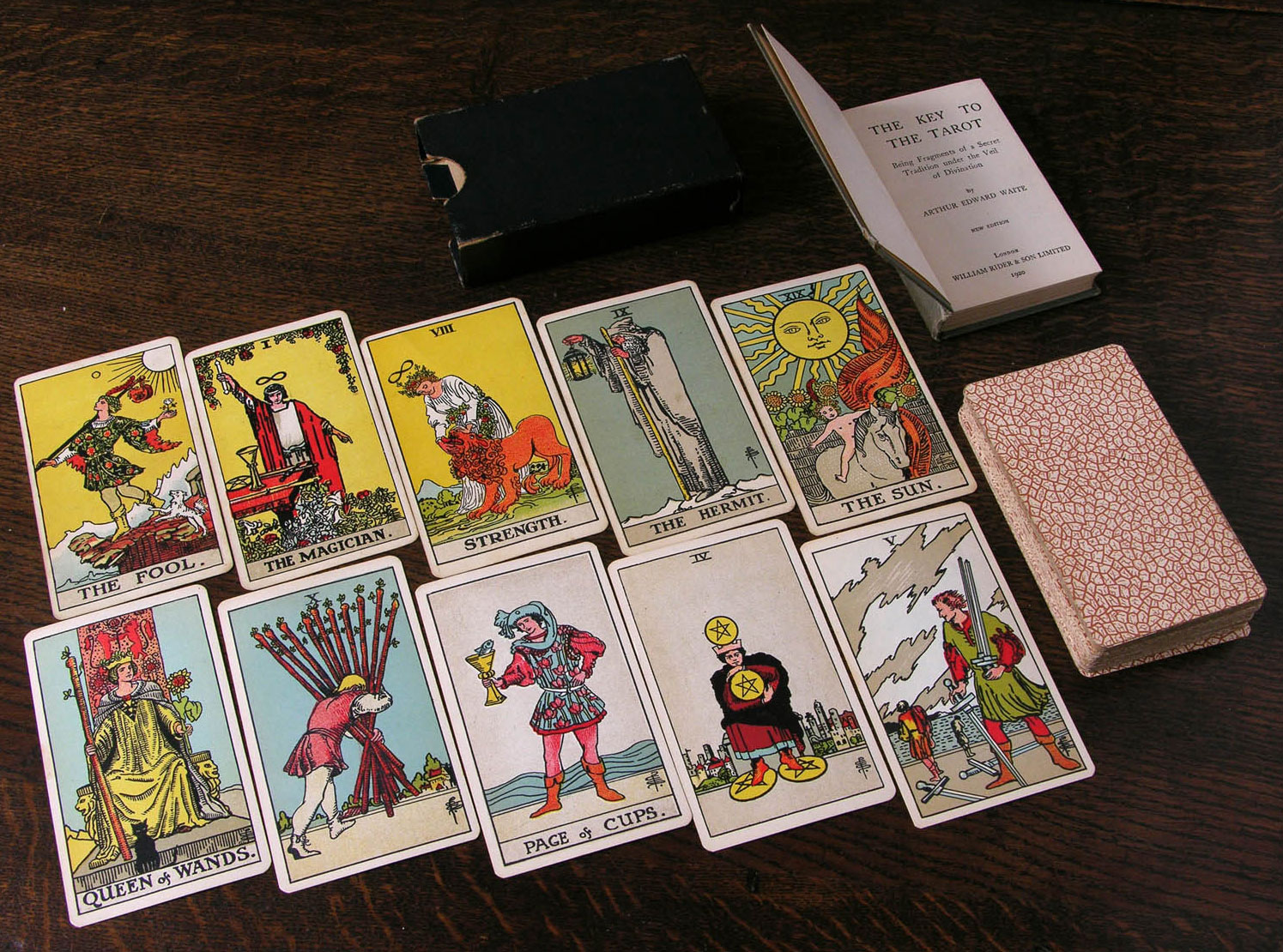
Top: A selection of trump cards (top row) and pip cards (bottom row) from the first edition of the Rider-Waite deck, circa 1909. Via the World of Playing Cards. Photo courtesy Bill Wolf. Above: Cards from a Tarot de Marseille deck made by François Gassmann, circa 1870. Photo courtesy Bill Wolf.

Top: A selection of trump cards (top row) and pip cards (bottom row) from the first edition of the Rider-Waite deck, circa 1909. Via the World of Playing Cards. Above: Cards from a Tarot de Marseille deck made by François Gassmann, circa 1870. Photo courtesy Bill Wolf.
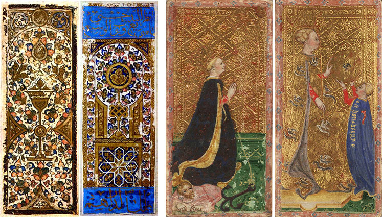
However, using cards for playful divination probably goes back even further, to the 14th century, likely originating with Mamluk game cards brought to Western Europe from Turkey. By the 1500s, the Italian aristocracy was enjoying a game known as “tarocchi appropriati,” in which players were dealt random cards and used thematic associations with these cards to write poetic verses about one another—somewhat like the popular childhood game “MASH.” These predictive cards were referred to as “sortes,” meaning destinies or lots.
Even the earliest known tarot decks weren’t designed with mysticism in mind; they were actually meant for playing a game similar to modern-day bridge. Wealthy families in Italy commissioned expensive, artist-made decks known as “carte da trionfi” or “cards of triumph.” These cards were marked with suits of cups, swords, coins, and polo sticks (eventually changed to staves or wands), and courts consisting of a king and two male underlings. Tarot cards later incorporated queens, trumps (the wild cards unique to tarot), and the Fool to this system, for a complete deck that usually totaled 78 cards. Today, the suit cards are commonly called the Minor Arcana, while trump cards are known as the Major Arcana.
Top: The popular Rider-Waite deck was first published in 1909. Above: Two hand-painted Mamluk cards from Turkey (left) and two cards from the Visconti family deck (right), both circa 15th century.
Two hand-painted Mamluk cards from Turkey (left) and two cards from the Visconti family deck (right), both circa 15th century.
Graphic designer and artist Bill Wolf, whose interest in tarot illustration dates to his art-school days at Cooper Union in New York, has his own theories about the tarot’s beginning. Wolf, who doesn’t use cards for divination, believes that originally, “the meaning of the imagery was parallel to the mechanics of the play of the game. The random draw of the cards created a new, unique narrative each and every time the game was played, and the decisions players made influenced the unfolding of that narrative.” Imagine a choose-your-own-adventure style card game.
“The imagery was designed to reflect important aspects of the real world that the players lived in, and the prominent Christian symbolism in the cards is an obvious reflection of the Christian world in which they lived,” he adds. As divinatory usage became more popular, illustrations evolved to reflect a specific designer’s intention. “The subjects took on more and more esoteric meaning,” says Wolf, “but they generally maintained the traditional tarot structure of four suits of pip cards [similar to the numbered cards in a normal playing-card deck], corresponding court cards, and the additional trump cards, with a Fool.”
This woodblock version of the classic Tarot de Marseille was published around 1751 by Claude Burdel. Photo courtesy Bill Wolf.


This woodblock version of the classic Tarot de Marseille was published around 1751 by Claude Burdel. Photo courtesy Bill Wolf.
Even if you aren’t familiar with tarot-card reading, you’ve likely seen one of the common decks, like the famous Rider-Waite, which has been continually printed since 1909. Named for publisher William Rider and popular mystic A.E. Waite, who commissioned Pamela Colman Smith to illustrate the deck, the Rider-Waite helped bring about the rise of 20th-century occult tarot used by mystical readers.
“The Rider-Waite deck was designed for divination and included a book written by Waite in which he explained much of the esoteric meaning behind the imagery,” says Wolf. “People say its revolutionary point of genius is that the pip cards are ‘illustrated,’ meaning that Colman Smith incorporated the number of suit signs into little scenes, and when taken together, they tell a story in pictures. This strong narrative element gives readers something to latch onto, in that it is relatively intuitive to look at a combination of cards and derive your own story from them.
1920PamC-edited
“The deck really took off in popularity when Stuart Kaplan obtained the publishing rights and developed an audience for it in the early ’70s,” says Wolf. Kaplan helped renew interest in card reading with his 1977 book, Tarot Cards for Fun and Fortune Telling, and has since written several volumes on tarot.

Though historians like Kaplan and Matthews publish new information on divination decks every year, there are still many holes in the larger story of fortune-telling cards. Wolf points out that those who use cards for divination are often at odds with academics researching their past. “There’s a lot of friction between tarot historians and card readers about the origins and purpose of tarot cards,” Wolf says. “The evidence suggests they were invented for gaming and evolved for use in divination at a much later date. Personally, I believe they were designed for game play, but that the design is a bit more sophisticated than many tarot historians seem to believe.”
“The earliest known tarot decks weren’t designed with mysticism in mind; they were actually meant for playing a game similar to modern-day bridge.”
By the mid-18th century, the mystical applications for cards had spread from Italy to other parts of Europe. In France, writer Antoine Court de Gébelin asserted that the tarot was based on a holy book written by Egyptian priests and brought to Europe by Gypsies from Africa. In reality, tarot cards predated the presence of Gypsies in Europe, who actually came from Asia rather than Africa. Regardless of its inaccuracies, Court de Gébelin’s nine-volume history of the world was highly influential.
Teacher and publisher Jean-Baptiste Alliette wrote his first book on the tarot in 1791, called “Etteilla, ou L’art de lire dans les cartes,” meaning “Etteilla, or the Art of Reading Cards.” (Alliette created this mystical pseudonym “Etteilla” simply by reversing his surname.) According to Etteilla’s writings, he first learned divination with a deck of 32 cards designed for a game called Piquet, along with the addition of his special Etteilla card. This type of card is known as the significator and typically stands in for the individual having their fortune read.
A hand-colored set of tarot cards produced by F. Gumppenberg, circa 1810. Photo courtesy Bill Wolf.

While the tarot is the most widely known, it’s just one type of deck used for divination; others include common playing cards and so-called oracle decks, a term encompassing all the other fortune-telling decks distinct from the traditional tarot. Etteilla eventually switched to using a traditional tarot deck, which he claimed held secret wisdom passed down from ancient Egypt. Etteilla’s premise echoed the writings of Court de Gébelin, who allegedly recognized Egyptian symbols in tarot-card illustrations. Though hieroglyphics had not yet been deciphered (the Rosetta Stone was rediscovered in 1799), many European intellectuals in the late 18th century believed the religion and writings of ancient Egypt held major insights into human existence. By linking tarot imagery to Egyptian mysticism, they gave the cards greater credibility.
Building on Court de Gébelin’s Egyptian connection, Etteilla claimed that tarot cards originated with the legendary Book of Thoth, which supposedly belonged to the Egyptian god of wisdom. According to Etteilla, the book was engraved by Thoth’s priests into gold plates, providing the imagery for the first tarot deck. Drawing on these theories, Etteilla published his own deck in 1789—one of the first designed explicitly as a divination tool and eventually referred to as the Egyptian tarot.

A few of the cards from Etteilla's esoteric deck, reproduced by Grimaud in 1890.
A few of the cards from Etteilla’s esoteric deck, reproduced by Grimaud in 1890.
“Etteilla was one of the people who actually made divination so esoteric,” says Matthews. “He created a deck that incorporated all the things from Court de Gébelin and his book ‘Le Monde Primitif’ [‘The Primitive World’], which suggested an Egyptian origin for the tarot and all sorts of arcane things.” Matthews makes a distinction between the tarot’s abstract interpretations and the straightforward “cartomantic” reading style that thrived during the 16th and 17th centuries, prior to Etteilla.
“When we used to send telegrams, each word costs money,” Matthews explains, “so you’d have to send very few words like, ‘Big baby. Mother well. Come to hospital.’ And you’d get the gist of it. I read cards in a very similar way—starting from a few general keywords and making sense of them by filling in the words that are missing. This isn’t the tarot style of reading where you project things, like, ‘I can see that you’ve recently had a great disappointment. Mercury is in retrograde and da da da.’ A cartomantic reading is much more straightforward and pragmatic, for example, ‘Your wife will eat tomatoes and fall off the roof and die horribly.’ It’s a direct way of reading, a pre-New Age way of reading.”

One of Matthews' favorite decks is the Lenormand published by Bernd A. Mertz in 2004 based on a design circa 1840. Photo courtesy Caitlín Matthews.
One of Matthews’ favorite decks is the Lenormand published by Bernd A. Mertz in 2004 based on a design circa 1840. Photo courtesy Caitlín Matthews.
Matthews has authored several books on divinatory cards, and her latest, The Complete Lenormand Oracle Cards Handbook, will be published in October of this year. This 36-card deck was named after the celebrity card-reader Mademoiselle Marie Anne Lenormand, who was popular around the turn of the 18th and 19th centuries, though the decks bearing her name weren’t actually produced until after her death. The oldest packs in Matthews’ collection are two Lenormand-style decks, the French Daveluy of the 1860s and the Viennese Zauberkarten deck from 1864, which were some of the first decks to be illustrated using the technique of chromolithography.
“Your wife will eat tomatoes and fall off the roof and die horribly.”
Oracle decks like the Lenormand tend to rely on more direct visual language than traditional tarot cards. “The tarot can often speak in broad, timeless, universal statements about our place in the world,” says Wolf. “The imagery of fortune-telling decks is more illustrational and less archetypal. The images are generally more specific, simpler, and less universal, keeping the conversation more straightforward.”
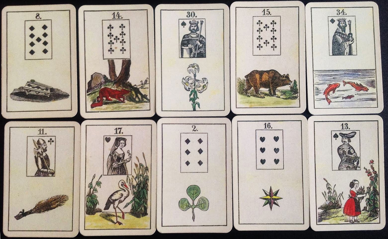
In contrast to most oracle decks, which don’t include suited pip cards, Lenormand cards feature a unique combination of numbered playing-card imagery on top of illustrated scenes used for fortune-telling. “One of the earliest versions, called the Game of Hope, was made by a German named J.K. Hechtel and was prepared like a board game,” says Matthews. “You laid out cards 1 to 36, and the object of the game was to throw the dice and move your tokens along it. If you got to card 35, which was the anchor card, then you’re home, safe and dry. But if you went beyond that, it was the cross, which was not so good. It was like the game Snakes and Ladders.” In this way, the Game of Hope fell into the Victorian-era tradition of board games that determined a player’s life story based on luck.
This Lenormand-style oracle deck shows a mixture of playing card and fortune-telling illustrations, circa 1870. Photo courtesy Bill Wolf.
The game’s original instructions said it could be used for divining because the illustration on each card included both a symbolic image, like the anchor, and a specific playing card, like the nine of spades. “Hechtel must have seen that there were overlaps between divining with playing cards, which, of course, everyone did, and his game,” says Matthews. “Many other oracle decks appeared around the same time at the end of the 18th century and into the early 19th century. They became really popular after the Napoleonic Wars when everyone settled down and became terribly bourgeois.
“Quite recently, it was discovered by Mary Greer that there was a prior source to the Lenormand cards,” she continues. “There’s a deck in the British Museum called ‘Les Amusements des Allemands’ (‘The German Entertainment’). Basically, a British firm put together a pack of cards that has images and little epigrams on the bottom, which say things like, ‘Be aware, don’t spend your money unwisely,’ and that sort of thing. It’s quite trite. But it came with a book of text that’s almost identical to the instructions for later packs of Lenormand cards.”
"Les Amusements des Allemands," circa 1796, has many overlaps with Lenormand decks. Via the British Museum.
“Les Amusements des Allemands,” circa 1796, has many overlaps with Lenormand decks. Via the British Museum.

By comparing various decks from different time periods, tarot-card enthusiasts can identify the evolution of certain illustrations. “For example,” says Matthews, “the modern version of the hermit with the lantern, you’ll find that that was an hourglass and he was Saturn or Chronos, the keeper of time. You can see how that translates with the Tarot Bolognese meaning of delay or blockage. It was about time moving slowly, though that’s not used as a modern meaning much now.”
Most card readers recognize that the associations and preconceptions of the person being read for are just as important as the actual drawings on the cards: Divination cards offer a way to project certain ideas, whether subconscious or not, and to toy with potential outcomes for important decisions. Thus, like scenes from a picture book, the best illustrations typically offer clear visions of their subjects with an open-ended quality, as though the action is unfolding before you.
Matthews’ favorite decks are those with straightforward illustrations, like the Tarocchino Bolognese by Giuseppe Maria Mitelli, an Italian deck created sometime around the 1660s. Matthews’ owns a facsimile of the Mitelli deck, rather than an original, which means she can use them without fear of damaging a priceless antique. “The deck that I enjoy most is the Mertz Lenormand deck because of its clarity,” she says. “The background on each card is a creamy, vellum color, so when you lay them out in tableau, you can see the illustrations very clearly. I frankly get so tired of all the new Photoshopped tarots and the slick art, with their complete lack of any framework or substance.

Trump cards from the Tarrocchini Bolognese designed by Giuseppe Maria Mitelli, circa 1664.

“I also enjoy reading with the Lenormand deck made by Daveluy, which has been beautifully reworked by Lauren Forestell, who specializes in restoring facsimile decks—cleaning up 200 years’ worth of card shuffling and human grief. The coloring on the Daveluy is very beautiful. Chromolithography gave an incredibly clear color to everything, and I think it was probably as revolutionary as Technicolor was in the days of the movies.”
The Lenormand imagery is reduced to the small colored segment at the top of the cards for the Geografia deck; the rest is related to world geography. Via eBay.
On the Geografia deck, the symbolic imagery is reduced to a small colored segment at the top of each card; the rest is related to global geography. Via eBay.
The illustration on some decks did double duty, providing divinatory tools and scientific knowledge, like the Geografia Tarocchi deck from around 1725. “The Geografia are extraordinary cards, almost like a little encyclopedia of the world with the oracle imagery peeking out at the top,” Matthews says. “The actual bit that you read from is just a cigarette-card length. So for example, the hanged man just shows his legs at the top of the card, while the rest of the card has information about Africa or Asia or other places on it.”

In contrast, the meanings in other decks are particularly difficult to decipher, like the infamous Thoth tarot developed by Aleister Crowley, notorious for his involvement with various cults and experimentation with recreational drugs and so-called “sex magick.” Completed in 1943, the Thoth deck was illustrated by Lady Frieda Harris and incorporated a range of occult and scientific symbols, inspiring many modern decks. As Wolf explains, “with the rise of the divination market in the 20th century, more liberties were taken, and the imagery evolved into increasingly personal artistic statements, both in content and style of execution.”
But to balance such arcane decks, there are divinatory cards that offer little room for interpretation, like “Le Scarabée d’Or” or The Golden Beetle Oracle, one of Wolf’s most prized decks. “It’s just fantastically bizarre. There’s a little window in the lid of the card box, and when you shake it, the beetle appears, and points to a number,” he explains. “Then you find the corresponding number on a set of round cards, with beautiful script text on them, and read your fortune. Can you not imagine standing in a Victorian parlor in France, consulting the Golden Beetle? It was like performance art.”

NOTÍCIA: A crônica visual do Rio oitocentista

Local: História Viva
Autor: -
Data: -/ -/ 2015.
Fonte: http://www2.uol.com.br/historiaviva/noticias/a_cronica_visual_do_rio_oitocentista.html

***

Até 3 de maio, Centro Cultural Correios expõe 120 aquarelas de Debret que ilustram o Rio de Janeiro do século XIX

Barbeiros ambulantes, aquarela, Jean Baptiste Debret, 1826
Os Museus Castro Maya, localizados nos bairros cariocas de Santa Teresa e Alto da Boa Vista, possuem alguns dos mais completos acervos das obras de Jean-Baptiste Debret (1768-1848), o francês que viveu por 15 anos no Rio de Janeiro – onde fundou uma escola de belas-artes e foi nomeado o pintor oficial da corte. Mas a coleção Castro Maya é pouco vista pelo público: apenas uma fração dos quadros se encontra em exposição regular.

Como parte das comemorações dos 450 anos da fundação da cidade, o Centro Cultural Correios reúne 120 aquarelas de Debret, que produziu algumas das mais icônicas imagens do Rio no século XIX. “Os desenhos e as gravuras eram a única forma de as pessoas conhecerem lugares distantes, e os europeus tinham muita curiosidade por esses locais exóticos do Novo Mundo, como o Brasil”, diz Anna Paola Baptista, curadora da exposição. “Debret é o cronista maior da vida brasileira na primeira metade do século XIX. Ele acompanhou e documentou visualmente o início do Brasil como nação independente, e especialmente o Rio de Janeiro.”

Depois da queda de Napoleão Bonaparte, Debret aceitou o convite de D. João para integrar a missão artística que viria ao Brasil e criar uma escola de belas-artes. A morte do único filho, aos 19 anos de idade, também contribuiu para a decisão de Debret de deixar a França. Instalado no Rio em 1817, retratou o cotidiano e os costumes dos cariocas.

O dia a dia nas praças, mercados e no cais do porto, a negociação de escravos no centro, e a movimentação dos cidadãos nas ruas. Pintou também ocasiões históricas, como a aclamação do Dom João VI, a ascensão de D. Pedro I com a proclamação da independência, em 1822, a chegada de D. Leopoldina e a coroação de D. Pedro II, em 1831. Pouco depois, Debret retornaria à França, onde editaria o livro Viagem histórica e pitoresca ao Brasil, compilando sua visão do país.

A importância do artista, responsável por apresentar o Brasil à Europa, se tornaria crucial também no país que retratou. “Ele se tornou um cronista do nosso passado. Nós passamos a imaginar o Rio do início do século XIX por meio das gravuras de Debret. Seus desenhos ilustram há gerações os livros didáticos de história do Brasil”, completa a curadora.

Serviço

O RIO DE JANEIRO DE DEBRET.

ONDE: Centro Cultural Correios, rua Visconde de Itaboraí, 20, Centro, Rio de Janeiro (RJ).

QUANDO: De terça-feira a domingo, das 12h às 19h. Até 3 de maio.

QUANTO: Entrada franca.

CONTATO: (21) 2253-1580.

SITE: http://www.correios.com.br/sobre-correios/educacao-e-cultura/centros-e-espacos-culturais-dos-correios/centro-cultural-rio-de-janeiro.